Mastering CSS cubic-bezier: Crafting Custom Timing Functions for Smooth Animations
In the world of web design and development, animations play a pivotal role in enhancing user experience. From subtle hover effects to complex transitions, animations can make your website feel more dynamic and engaging. While CSS provides several built-in easing functions like ease, linear, ease-in, and ease-out, sometimes you need more control to create the perfect animation. This is where the cubic-bezier function comes into play.
What is cubic-bezier?
The cubic-bezier function allows you to create custom easing functions for your CSS animations. It defines a cubic Bézier curve, which is a mathematical curve used in computer graphics to model smooth transitions. By customizing the control points of the curve, you can achieve precise control over the speed and timing of your animations.
Understanding the cubic-bezier Function
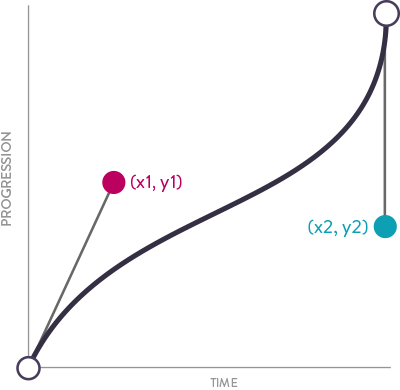
The cubic-bezier function takes four parameters: cubic-bezier(x1, y1, x2, y2). These parameters represent the coordinates of two control points, which determine the shape of the Bézier curve.
x1 and x2 must be between 0 and 1, as they represent the time progression of the animation.y1 and y2 can be any value, representing the output values of the animation.
The default easing function, ease, can be represented as cubic-bezier(0.25, 0.1, 0.25, 1).
Creating Custom Easing Functions
To create your own custom easing function, you can experiment with different values for the control points. Here are a few examples to get you started:
-
Ease-in-out
.ease-in-out {
  transition: all 0.5s cubic-bezier(0.42, 0, 0.58, 1);
}
-
Ease-in
.ease-in {
  transition: all 0.5s cubic-bezier(0.42, 0, 1, 1);
}
-
Ease-out
.ease-out {
  transition: all 0.5s cubic-bezier(0, 0, 0.58, 1);
}
-
Bounce Effect
.bounce {
  transition: all 0.5s cubic-bezier(0.68, -0.55, 0.27, 1.55);
}
Visualizing Bézier Curves
Visualizing Bézier curves can help you better understand how the control points affect the animation. Several online tools allow you to interactively adjust the control points and see the resulting curve. Some popular tools include:
These tools provide a visual representation of the curve and its impact on the animation, making it easier to fine-tune your custom easing functions.
Practical Example
Let's create a simple example to demonstrate the power of the cubic-bezier function. We'll animate a box that moves from left to right with a custom easing function.
HTML:
<div class="box"></div>
CSS:
.box {
  width: 100px;
  height: 100px;
  background-color: #3498db;
  position: relative;
  transition: transform 1s cubic-bezier(0.68, -0.55, 0.27, 1.55);
}

.box:hover {
  transform: translateX(300px);
}
In this example, we use a cubic-bezier function to create a bounce effect when the box moves. When you hover over the box, it will transition from left to right with a bouncing motion.
Conclusion
The cubic-bezier function in CSS provides unparalleled control over the timing and behavior of your animations. By understanding and experimenting with the control points, you can create smooth and captivating animations that enhance the user experience. So, next time you need to fine-tune your animations, remember the power of cubic-bezier and unleash your creativity!
Happy animating!
